


Springshot’s design team has created an intuitive platform that enhances collaboration and helps solve problems among remote workforces. This creative process takes an attention to detail that Hannah Andersen, Senior Product Manager at Springshot, knows all too well given her five years with our company.
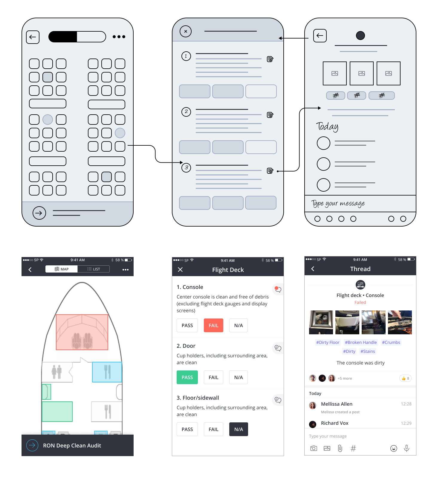
At its core, Springshot’s newest feature, our auditing platform called Springshot Forms, is an easy-to-use tool that simplifies communication between remote teams and ensures tasks have been completed. Its clean design buildout, led by Andersen, improves the experience when workforces connect while completing Missions and especially during the verification, or audit, process that is the key component to Forms.
Following the recent rollout of Springshot Forms, Andersen talked about the humanistic approach we take to our design and user interface solutions.
Can you talk through your design process for Springshot overall and for Forms?
We focus on making design simple, innovative, fun, and easy to use. The first step was deciding what we want to display to users, what relevant information they may need. The customer may tell us they want something specific, but it’s our job as the product and design team to go beyond that and really put our head in their position and think beyond the limits of what they may actually need, while also thinking about the persona of the user while on the application.
Alot of the design and ideation process is focused on the Aviation industry, but whenever we develop any feature or product, we try to make it as generic as possible so it can be used for many different workflows and in any industry, such as restaurants or pet grooming. We always ask ourselves: Would it work in the same way? We are making sure that this feature can benefit all of the people within the operation.
Often users don’t come from a very technical background so it’s definitely important that a platform is easy to use for someone who isn’t that comfortable with technology. We are also thinking about the conditions and the person that’s going to be using the application. We think about whether the button placement will work. We also think about what the weather conditions are — is it raining? Is it sunny? Are the users on a cart, are they moving? Is English their first language? Should we use an icon instead of words? What makes sense when words are translated into German, Japanese and Spanish? Do we have an icon and text? Do the words still fit in the space when they are translated?
What does your team do once you understand users and how they would interact with Springshot?
Once we have an understanding of a customer’s issues and figure out how we want to tackle them, it is critical to start thinking about the real use cases of how this is affecting people in the operation using the application.This is an intensive collaboration, and we go through every single pixel and use case. We brainstorm what would happen if this occurs or if that takes place. We are anticipating what their questions are going to be, and what the issues are going to be to try to solve them in this phase. One design could have 20 different scenarios or answers for one user. The same treatment may not make sense for one person versus another. We run all the different scenarios, and we built it in a way that can make it adapt and be customizable.
Then, we begin to develop wireframes to bring the idea to life through innovative ways to display the information. We build out the wireframes and hand off a skeleton design to the design team. We meet internally and communicate different needs and requirements. It’s an intensive design review process. We are showing complex information in a clear way, and we try not to overwhelm users with too many data points.
As a team, we work well together. We all bring in very different points of view, and we are a great mix of analytical and creative brains.
How does the use of color factor into your designs for Forms and Springshot as a whole?
Everything we do is intentional in terms of colors, but we try to use color sparingly so that it’s for specific reasons. For example, a blue area means it’s clickable. We are also trying to stay consistent on the web interface as close as we can to the mobile application.
It’s also the small touches of color that make it fun. Users can choose a channel avatar or their own icons, and we spend time coming up with all the different colors, designs and choices. We often have so many ideas we need to have an internal vote on our favorite designs and color choices.
One area to note is that customers have been asking for years about adding a tagging functionality. And now with our Tagging feature within Springshot Forms, auditors can tag Mission outcomes with specific issues, such as broken seats. A failed outcome generates a discussion thread, where photos, tags and comments are added. Airlines look at the tags and recognize the most common tags; for example, on the 737’s, the biggest issue is broken seats. This tag is really beneficial for customers to identify higher level issues that are happening within the operation and then take action collaboratively in real time. A cleaner is tagged to try to fix the issue, for example.
The purple color of the tags add visual interest for the tags on the screen, and we chose that color intentionally. We tried many different colors of tags before we settled on purple for a balance with the rest of the color palette.
How does your design help engage users?
The term we like to use with the hierarchy of information is “progressive reveal.” This means showing the right information at the right time and not overwhelming the user. They just need: What it is, where they need to go, and what time does it start. We try to hide the secondary information, but also provide the flexibility that if users want to see everything, they can check all the boxes on the filter and it can show everything. We try and keep the messaging very light, such as, “great job,” “keep going,” or “we see you.” We definitely try to make the general brand messaging very friendly.
Springshot also leverages gamification within Missions, and a great way to engage users is through XP points that they can earn during each Mission. If they complete all their tasks within certain criteria, such as speed or engagement, they can earn XP points. You can see everyone who worked on the Mission, and you can see who earned the most XP points. It’s kind of like a competition with a leaderboard.
We want people to feel empowered to do their work through this app. We want them to feel proud of the work they did and for other people to see their accomplishments.
What’s next for you to focus on at Springshot?
We’re brainstorming and strategizing how we can build upon user engagement and continue to help people feel empowered and recognized. We also are working on lots of creative solutions for the product in the upcoming months and excited to take the user experience to another level.