


What makes a good visual brand? Is it a strong, recognizable logo? A memorable color palette and design aesthetic? The truth is that branding and design are more important to consumers and employees than they may realize. Branding and design create a visual language — a means of communicating before a single word is said — that connect us to companies and set expectations well ahead of any sales message. Successful branding creates interest, excitement, comfort, familiarity, and trust.
The work that goes into creating a great visual brand is vast and intricate. At Springshot, we are lucky to have a brilliant partner who helps guide our brand growth and development, including a full visual refresh just last year.
We sat down with our incredible branding and design team, Good Bones Studio, to take a deeper dive into the evolution of Springshot’s visual identity. Learn more from Good Bones Owner and Principal, Caleb Heisey:
Q: What first appealed to you about Springshot? Why did you want to get involved in their brand design?
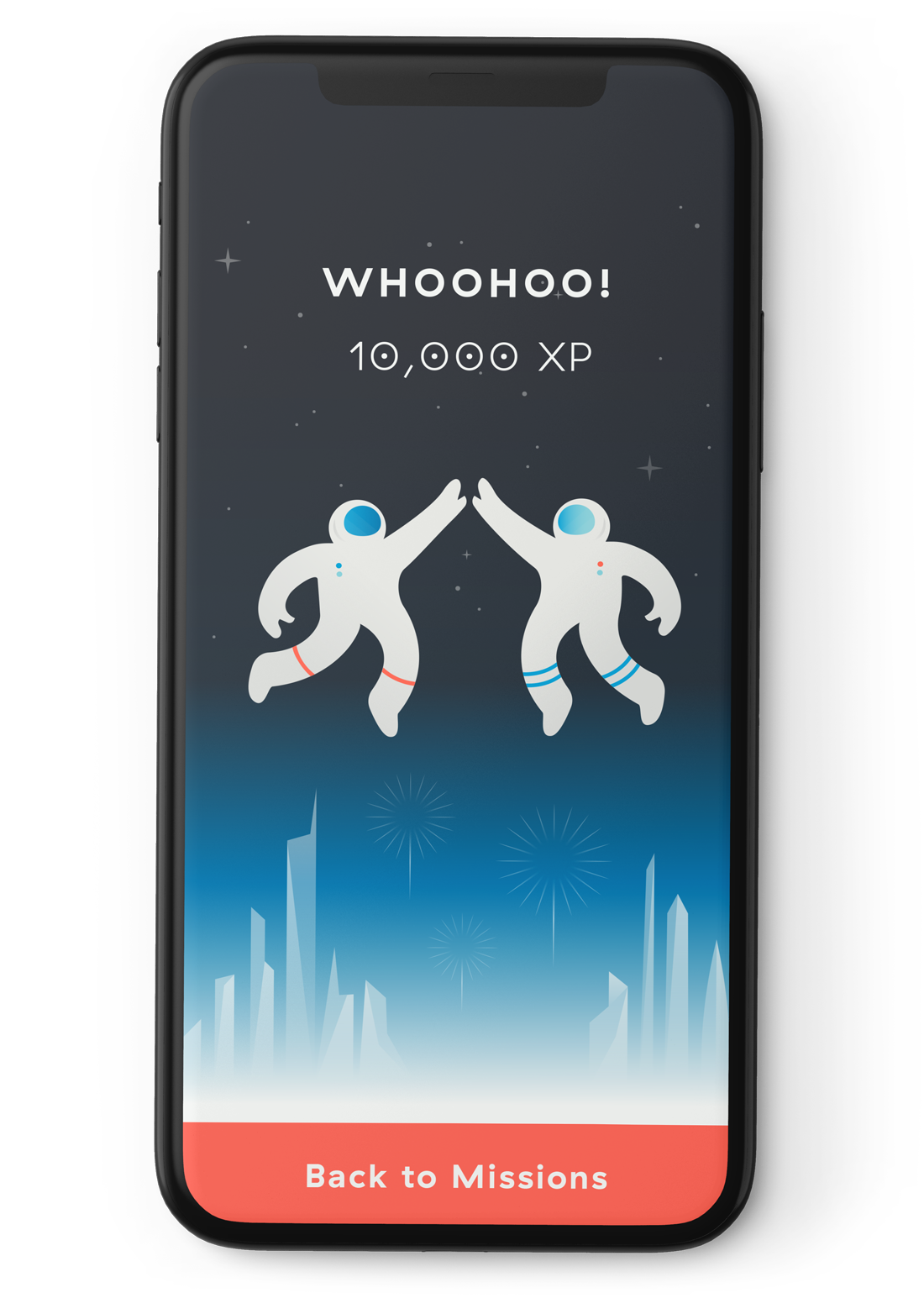
The first collaboration between Good Bones and Springshot was actually product-related. They approached us to help design and implement an extensive badge icon system that would exist in their user interface as awards for completed missions. From the get-go, it was clear that Springshot wanted to go above and beyond in creating a platform that was meant to support their users’ well-being. It has been rewarding to work with folks whose main mission is to elevate essential workers and celebrate their critical work.
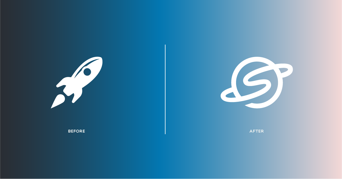
Springshot CEO Doug Kreuzkamp approached us to help refresh their previous logo, the rocket. It was important for us to bring those same design sensibilities from the badge icons to their brand mark. We continued to work with Springshot in the following years on bringing a fun, friendly, and human-centered design to their internal marketing.
Q: When did you first join the team, and what was your approach to exploring the redesign?
Having worked with Springshot for several years on product, marketing, and logo design positioned Good Bones to be an excellent partner when approaching their rebrand and website design. We felt like we were already a part of the team and were ingrained in their team workflow and company philosophy.
When approaching the Springshot brand we wanted the visual identity to be more unique and professional than previous iterations. We developed several concepts centered around three brand pillars: mission control, upwards trajectory, and “your crew.” We thought the best way to achieve these brand goals was to lose the tech rocket cliche but keep the spirit of the rocket launch. After presenting our brand concepts deck to the Springshot team, I received an email less than 3 hours later that they loved one concept in particular and were ready to move forward. A Good Bones record!
Q: How does the Springshot brand design help illustrate the company story? What sort of decisions did your team make to bring the brand to life for not only its customers but also its users and its employees?
Springshot decided that their brand should be more playful and human-centered, than technical and authoritative. We all “gravitated” around the idea that Springshot is a gravitational pull that keeps users in your orbit. The idea of satellites, moons, and orbital paths was a natural fit for a Springshot logo. We loved the concept of Springshot being the planet, and your clients using your gravity to propel themselves like a slingshot. The orbit path itself forms an ’S’ which also serves to show speed and velocity. The execution of the logo is rounded and curvy, which feels extremely approachable and friendly. Likewise the rest of the brand follows in this same style. Illustration is also based on loose curves. To bring a bit of seriousness to the brand concept, we’ve selected a small range of colors: a soft black, warm grays, a bright tangerine orange, and a friendly, techy blue.

Q: What makes the Springshot brand stand out, especially against others in the tech space?
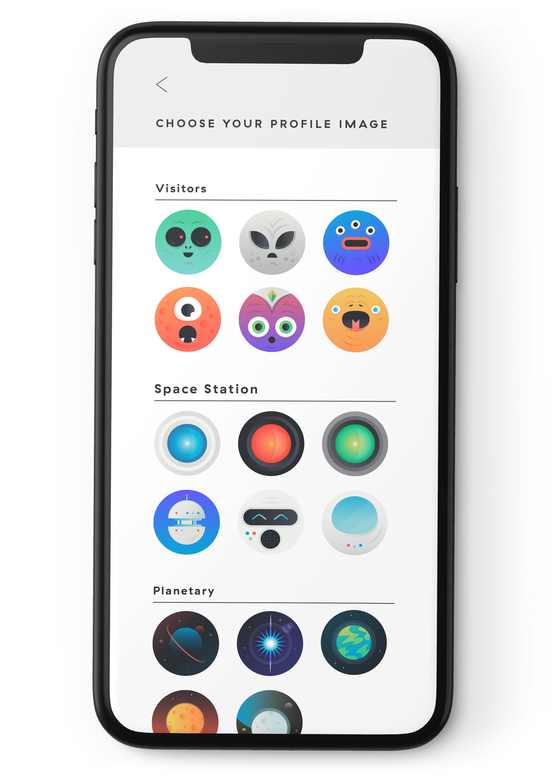
Illustration in tech brands isn’t a new strategy, but with Springshot we’ve really taken it to the next level. Both Josephine Courant, the Creative Director, and Doug wanted to “brand” Springshot from the inside out and have a truly holistic graphic approach. Since the initial brand and website launch, we’ve worked with the Springshot engineering and product team to integrate that quirky, whimsical vibe at every level of the application. Many B2B tech companies invest in branding on a marketing level, but it rarely permeates into their product — at least not nearly to the level that Springshot has dedicated to their platform.
Q: The astronaut character, SIM, is a really unique element of the Springshot brand. What inspired its creation?
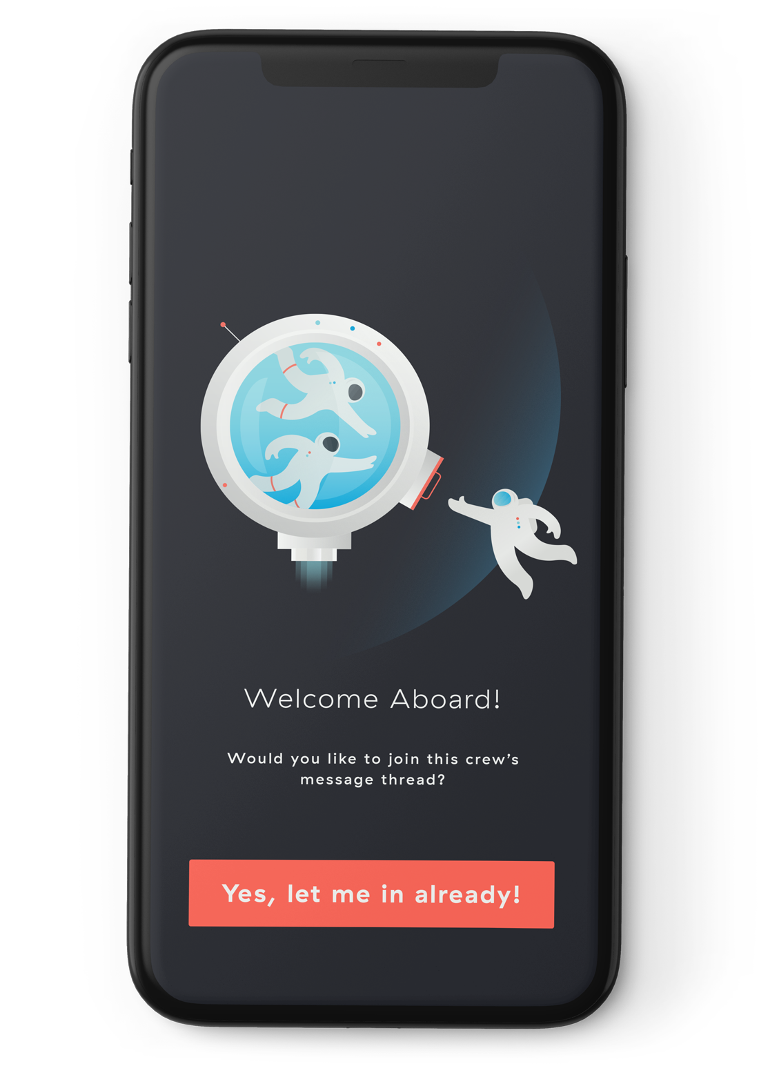
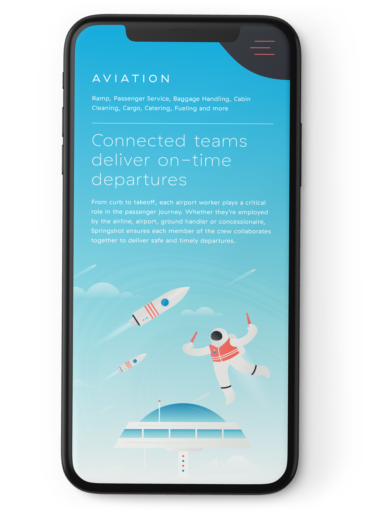
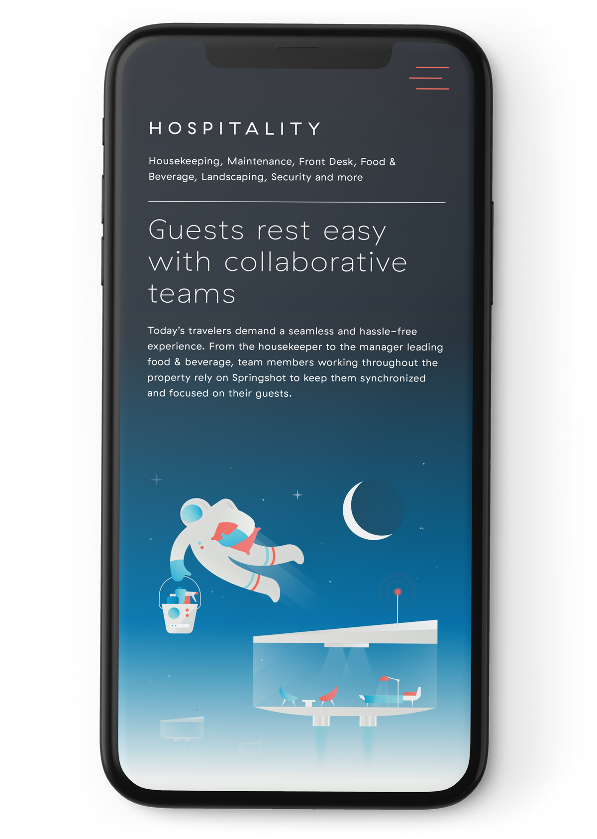
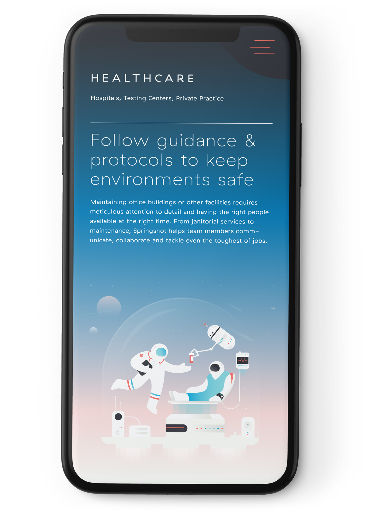
SIM is truly the keystone of the Springshot brand, not because astronauts are a revolutionary or unique visual in tech branding, but because we’re using the astronaut motif to really give essential workers a sense of importance and community. Each member of a crew has an essential and special role to the group as a whole. No one person is more important than another, and each member is valued. This concept conjures feelings of camaraderie that was important for Springshot to embody.
Q: What do you love most about the branding you developed?
I consider the Springshot logomark to be one of the strongest brand marks we’ve designed at Good Bones. We went through dozens of iterations trying to get a seamless combination of a planetary orbit and an S.
Q: Tell us a little more about Good Bones Studio, your design philosophy, and the amazing work you do!
Good Bones Studio designs big brands for small businesses and tech startups. We’re passionate about helping the little guy get ahead with top-notch logo, website, and packaging design. We’ve worked with clients across several industries, from cyber security to coffee roasters. But the one thing that ties them all together is that they have a product or service that makes the world a better, healthier, and more inclusive place — and that is a value that has never led us astray.
Our name embodies our design philosophy: We design brands with a strong conceptual foundation that will stand the test of time. We don’t chase a style or trend in our designs. We know that building a brand is a huge investment for many of our clients, and we want to ensure that our solution is sound conceptually and stylistically.