

At Springshot, we combine complicated programming, technology, and data into a thoughtfully-designed platform that is accessible, fun, and easy to use.
We have always felt that our app must look great — and feel authentic — in order to encourage worker interaction. We know we are the worker’s voice out in the field, we embrace it, and we center our designs around this fact. On our backend, though, there are competing components that we must reconcile: design that connects within numerous industries, makes sense in various languages and countries, and accounts for all the different types of people who use Springshot.
We have purposely designed Springshot with all of this humanity in mind.

To provide more detail behind our aesthetic decisions, we recently sat down with Creative Director Josephine Courant, who has worked at Springshot for over seven years managing our brand’s story across mobile, desktop products, our website, and social marketing. Courant shares the backstory on Springshot’s creative processes and why we have chosen to focus on the principles of Human-Centered Design.
Q: Why is design important?
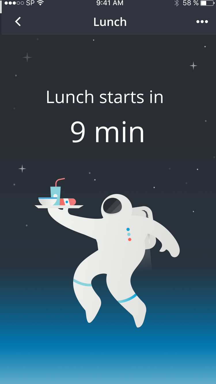
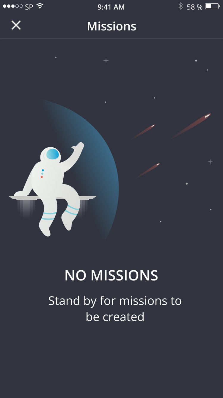
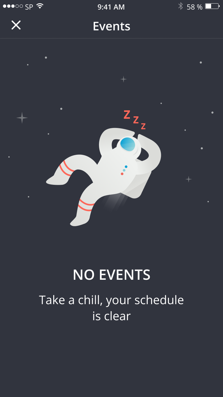
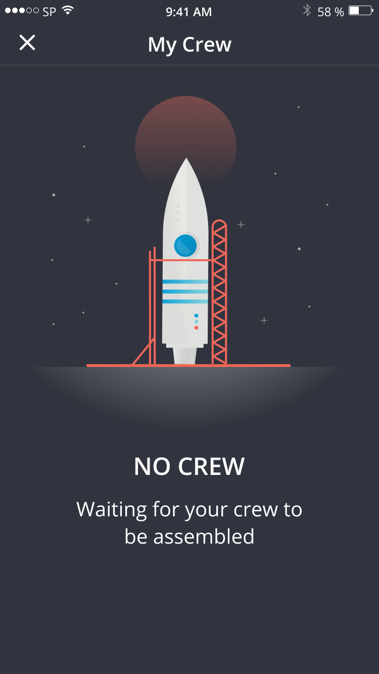
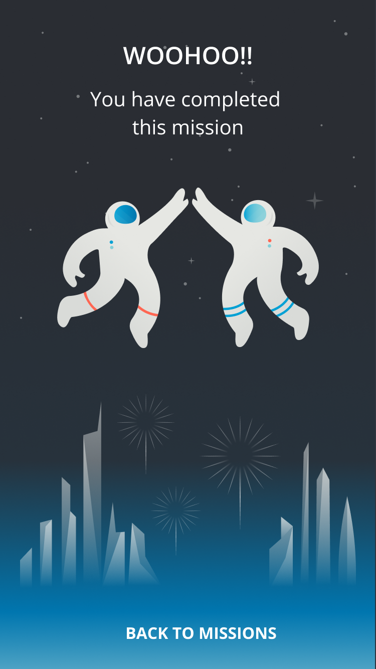
When design is done thoughtfully, users feel it. Good design makes users feel calm, competent, happy, or even sad, if that is the desired intent. We care deeply about design and how our platform looks and interacts. Yes, people have to use our Springshot app for work; it’s not a game, it’s a utility to get important work done on time. And we want it to feel a little fun, too. But Springshot, with its features like our astronaut avatar SIM (Springshot In Motion) flying in and giving high-fives after a mission is finished, really conjures the emotional responses to the design, whether that’s conscious for a user or not. The goal is to bring up emotions like, “Yes, I did it!” Or, “That’s really cute. That’s kind of fun.”
So it’s sometimes hard to explain, but we embrace a philosophy called Human-Centered Design because this path helps users feel an emotional connection to our product. This is especially noteworthy when it’s a work platform that users are required to interact with each day.
Q: What exactly is Human-Centered Design, and why does this methodology work for Springshot?
Human-Centered Design is the real laser focus on the end user. It uses a combination of research on how users use the technology, empathy, design-thinking and an agile mindset and an ability to pivot quickly to changing circumstances. We take the complexity of the backend of the Springshot platform and design a user interface that is intuitive, easy, and fun to use.
There are four stages of Human-Centered Design and Marketing, originally created by the global design firm IDEO, that we keep core to mind always:
1) Walk in customers’ shoes.
2) Listen with empathy and authenticity.
3) Make a human impact in a busy and complicated digital world.
4) Crece together with customers, employees and stakeholders — collaboration is key. We constantly engage with our customers to make improvements for their specific needs.
Most of our users work in strenuous, often monotonous jobs, and with that in mind, we want the design of Springshot to inform, engage, and encourage at all times. We also know that first impressions count. To that end, every piece of our Springshot platform has the same design, from the app, the website, and social media to our auditing platform, Springshot Forms, or our white papers and case studies, anything shown to a client or potential client.
Q: What are some specific Human-Centered Design elements that set Springshot apart?
There are several areas we’ve focused on over the last 10 years to make our platform thoughtful and customized. We make sure to have the call to action on each screen that is very specific and very obvious. There has to be a clickable area of a button that is just easy — it has to imply click here without saying “click here”. We have to take into account whether our users are using our application outside or indoors, in different weather conditions. Our app can be used in many different languages to accommodate users for whom English is not their first language.
When it comes to the fonts we use, we purposely test different sizes and configurations. Take the baggage handlers, for example: The gate and the location fonts have to be much bigger because these workers are constantly on the go and need to check gate numbers quickly and efficiently. Then, when thinking about Springshot Forms, how each client uses each form, there’s a slightly different variation that they need based on different scenarios. Each answer spurs another question. We think of — and design for — all of this throughout our iterative process, working alongside our VP Product, Roshan Patel.
Once the app’s design is ready, the client may then come back with two or three small changes. In one instance, for baggage car handlers, we found they needed a different grid with bigger font and to get rid of some information that didn’t apply to others. Or maybe we’ll need to add this bit of text, or we need to add a location, or we need to know what kind of bag it is. There will be small nuances that we will work with the team to incorporate into the design.
Q: Why do you spend so much time on the design of each icon, for example?
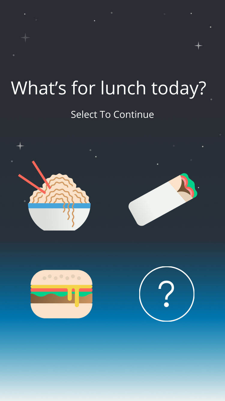
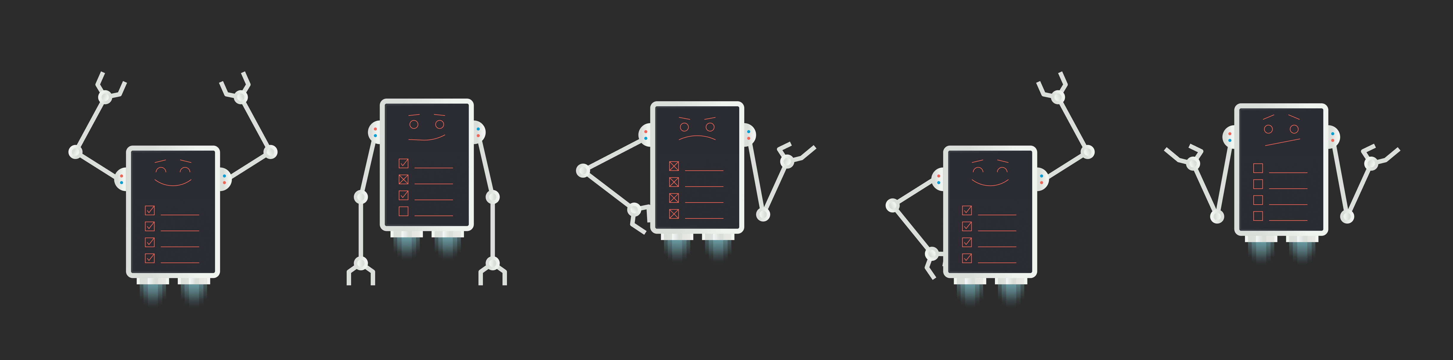
It would be very easy to say let’s not have icons, but icons are a universal language. You don’t have to translate icons. We have spent hours behind the scenes figuring out every single mission, every job in Springshot; we’ve spent an hour talking about a single icon alone. There are hundreds of missions and all have an icon — baggage pickup, food prep, an unaccompanied minor, a bathroom. Each one of those missions needs to have an icon that represents what that job is so we can better communicate with our workers and they can communicate amongst themselves. Our designer Caleb Heisey also created an amazing library of avatars for users to choose from. While the icons are more functional and practical, our custom avatars are fun, engaging and vibrant and adds a definite whimsical personality to the design.
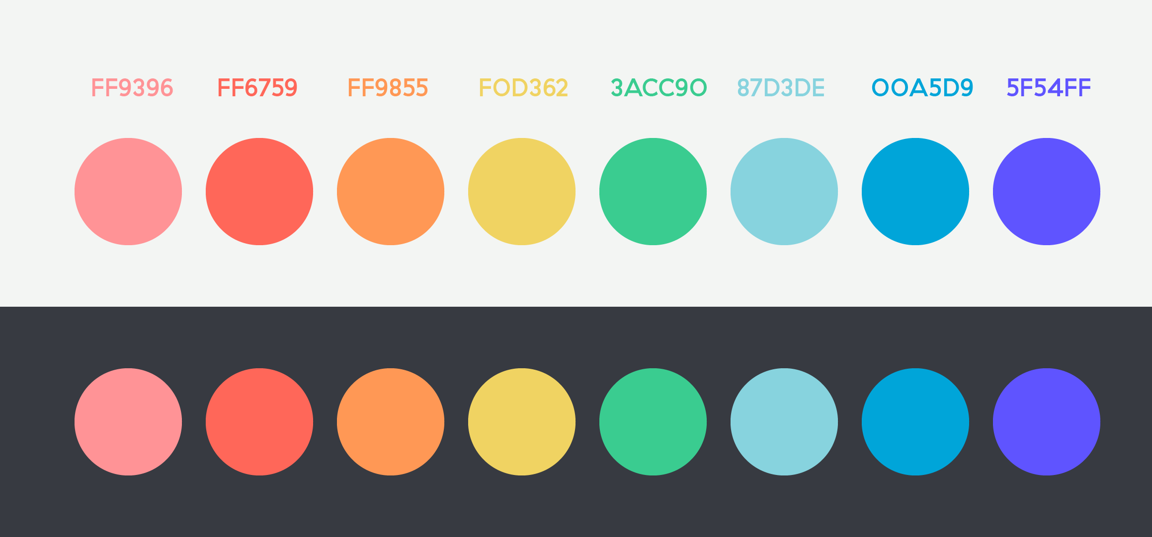
Q: Can you talk about the purposeful color choices made for Springshot?
The app used to be very monochromatic. It was black and blue, sort of like a corporate palate. Now a main call to action is the color tangerine. And we have a primary and a secondary palate. The primary is the blues and the grays and the tangerine/orange. But even with that gradient, it’s very thoughtfully done. There’s a primary blue and then a default, an active state and then an inactive state. So you’ve got the structural formal colors that are more practical. A secondary palate is what we use for iconography. We’ll have a fun purple and a green, and those are to liven up the app and make it have more personality.
Within the app, we also have a mix of line icons for the navigation and then job icons are more filled in and solid. That design is constantly evolving, too. Right now, it’s a much cleaner, minimalistic view. It’s more white space. It’s a clean and concise design. There are secondary bits of information that are hidden, but you can always access it. So there’s a much better hierarchy of information on the screen.
Q: Tell us about the design behind your main avatar, your astronaut character called SIM?
With SIM (Springshot In Motion), it is purposely designed to have no race, no culture, no age. It’s completely gender neutral. But SIM’s design is meant to also showcase someone who is hardworking, engaging, inspiring, helpful, authentic, and also a little bit of a push and encouragement. It’s a constant throughout the marketing and within the app, and we will continue to build SIM’s interactions with users in upcoming years.
Q: Do you have a focus on making the Springshot app friendly from an accessibility standpoint?
Yes, I want to take that human design sensibility and really focus on the accessibility factor of the workers, and this is also important because people learn in different ways. There are people who are colorblind so via the contrast in coloring, we can create a dark and a white skin, or if you’re outside at nighttime, should it be reversed? In the future, we could be incorporating audio as one messaging option; instead of chats, there are audio files for people to make.
We’re also thinking about sounds and tactile vibrations. If someone doesn’t have their sound on it, what’s the vibration? And there are a lot of different vibrations. This also comes into play with the notifications and which sounds we use. We’ve gone through a lot of different versions.
Q: What are some design components you’re thinking about for future iterations of Springshot?
Definitely incorporating accessibility into our design, as I mentioned. Also, something we’re thinking about is synching to smart watches. You’d start a mission or the mission comes to your watch and you just press “go”. But the design on the web app has to be really focused on this, too, and it’s very complicated, affecting different platforms and people.
As the team grows, we are really eager to start implementing gamification into our app in order to incorporate designs like badges, interactions, encouragement, messages, and trophies, so that the whole company can see teams succeed.